- Jon Hellevig
- January 13, 2020
- 4454
Widening Income and Wealth Gap and Stagnating Wages in America
With the stock market at all-time highs, virtually no unemployment (according to official statistics), and brisk GDP growth (according to official figures) in the last decade, economic analysts would declare that the US economy is in excellent shape. But, it isn’t. The stock market is a central bank financed bubble, and the GDP growth is an illusion brought about by this financial bubble and by pumping the economy up with record federal borrowings to finance the deficits that America cannot afford. Rigged statistics showing artificially low inflation serve to hold together the trumped up American economic narrative. (Read below more about the inflation scam). And the low unemployment figure is a chimera based on misleading statistics.
The big story covered up by all these figures repeated by rote is the gradual impoverishment of the American worker. That’s an inconvenient truth increasingly difficult to hide as the American dream has turned into a nightmare for huge swathes of the population. The superrich are grabbing an ever-increasing part of the American pie at the cost of all the rest who only get table scraps and leftover crumbs, if anything.
First Top 10%, then Top 1%, then Top 0.1% took it all
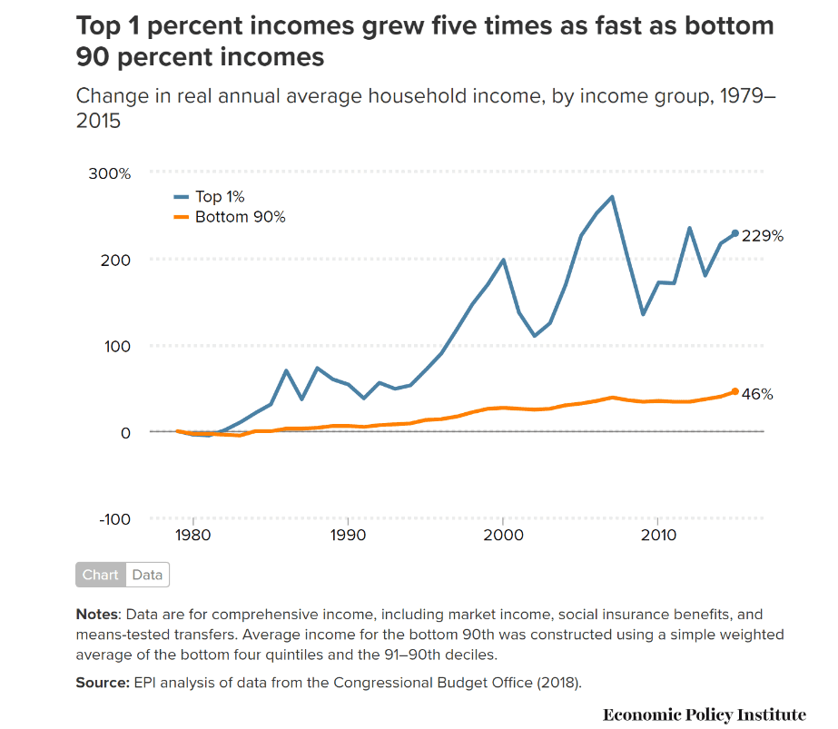
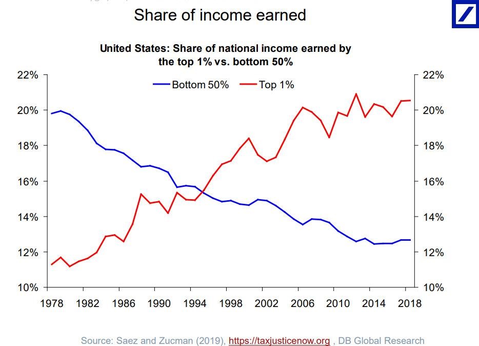
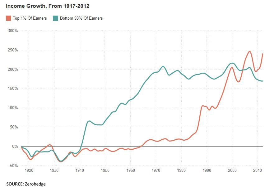
During the last decades, the financial rewards from the rigged markets first flew exclusively into the pockets of Top 10%, but later it was increasingly Top 1%, which pocketed most, perfectly illustrated by below charts.
The income of Top 1% has grown five times as fast as that of Bottom 90% income since 1970, who now earn double the amount of income than 160 million poor of the lower 50% stratum
The fortunes of Top 1% and Bottom 50% are now reversed.
It was bad enough in 1995 when Top 1% earned as much as Bottom 50%, but today the richest 1% already take 20% of all income leaving the bottom half with only 12%. As the chart shows, back in 1978 – before the neoliberal creeping coup really got going – the trends were reversed. Below chart compares income growth since 1920 of Top 1% to Bottom 90% (that is, all the rest except Top 10%). We see that right after Ronald Reagan entered the presidency with his Chicago School snake oil influenced backers, the income growth of the 1% started its dizzying growth, which is continuing to this date.
The next chart takes a longer perspective – while widening the sample to Top 10% – and shows their share of the total income since 1910 to 2010. The Roaring Twenties – the period before the 1929 stock market crash and the ensuing Great Depression – experienced the same level of glaring inequality as today’s America. With Franklin D. Roosevelt’s reforms, the egregious average income inequality was tamed and stayed relatively low until Reagan’s fatal presidency. And, it’s been downhill ever since – or uphill, if we look at it from the perspective of the rich.
Average income of the bottom 50% has stagnated at around $16,000 since 1980, while the income of the top 1% has skyrocketed by 300% to approximately $1,340,000 in 2014. As a result the average earnings differential between the top 1% and the bottom 50% has shot up from 27 times in 1980 to 81 times today.[1]
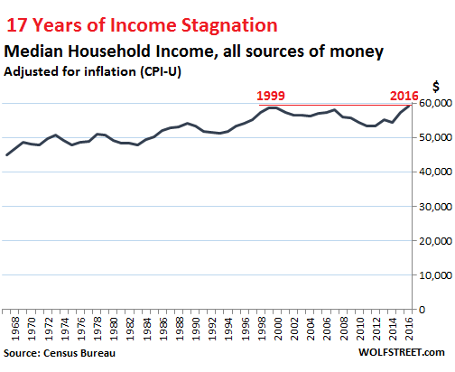
Another study confirms that after adjusting for inflation, the middle-class households had in 2015 basically the same income as they had in 1979.[2]
But the problem is that while the median has had this questionable 37% growth, the 50% earning less have seen practically no income increase. We have to move to Top 40% to see some actual growth over that half a century. But we have to go all the way up to Top 20% to see where the real action has taken place. The below chart tells the story of the 5% – having seen their real income soar by nearly $200,000 or 112% since 1967.[3]
In the two decades from 1997 to 2017, only the Top 5% of households saw their income increase.[4]
Income and wealth inequality in Russia
In this connection, we must be reminded that income and wealth inequality in Russia is nowhere the levels they have reached in the United States. In a study of 2018, I have addressed this issue by a detailed analysis of the false claims to the contrary advanced by Thomas Piketty and his collaborators.
In the report, I expose the bias and reveal the multitude of methodological errors, distortions and misrepresentation of data, which have gone into producing the Piketty conclusions. After identifying the deficiencies, we have adjusted the main findings announced by the Piketty scholars to reflect the actual data. The corrected data shows that instead of earning 45-50% of national income as claimed by the Pikettys, the top 10% of Russians earned less than 30% of the income. Correspondingly, our corrected data shows that instead of owning more than 70% of the national wealth, the wealth of the top 10 percent of the population was 39% of private wealth and 32% of total national wealth. You may access the whole study from this link.
Stagnant wages since 1972
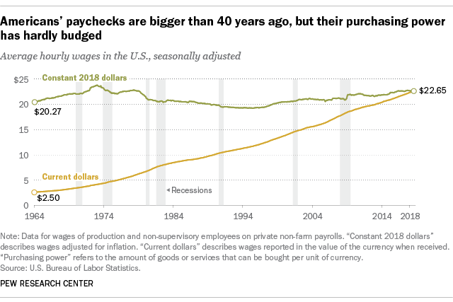
If possible, the situation with wages and salaries paint an even bleaker picture than total household income (which latter contains all types of income in addition to wages). For most American workers, real wages have barely budged in decades. By end of 2018, the real inflation-adjusted average wage had about the same purchasing power it did 40 years ago.[5] As the below chart illustrates, the real average hourly wage which was $20.27 in 1964 had only inched up to $22.27.
From another viewpoint, we see that the real average hourly wage today has just the same purchasing power it did in 1978.
David Stockman calculated that the real hourly worker’s wage was in 2019 still at 1972 levels.[6]
A recent study found that 53 million Americans or 44% of the working age population earn a median average annual salary of only $18,000. Basically then, at least half of the Americans are working-poor earning less than $18,000 per annum or less than $1.5 thousand per month..[7] This study confirms yet again the above reported facts about how impoverished and destitute most Americans have become. With the present outrageous cost of living, life has become a constant tightrope walk where one bad move, misjudgment, or disease could throw the person irrevocably into a financial abyss.
Although the job participation rate has been falling, a lot of jobs have indeed been created, but these are overwhelmingly low-paid part-time and gig jobs. Therefore below Top 10% wages and total household income have been stagnant, at best.
The corporate media cheerleaders tend to report – and hype up – the figures on the minimal gains during the last years in the hypothetical average hourly wage, but it gets yet much worse with the real weekly earnings. Thing is that because of the increasing share of part-time and gig jobs, workers do less hours than earlier. As of 2014, the average hours per week has fallen from around 39 hours to under 34 hours. Economist Mike Shedlock calculated that the actual hours worked and the average hourly earnings would deliver a weekly income of $690, well below its $825 peak back in the early 1970s.[8] If we multiply the hypothetical weekly earnings by 50, we get an annual figure of $35,497. That’s a 16.4% decline from the similarly calculated real peak in October 1972. That would in 2014 have translated to a 16.4% decline of annual earnings in real terms. Again, do note, that this is using the cooked up inflation index, so the picture might actually be yet much worse in reality.
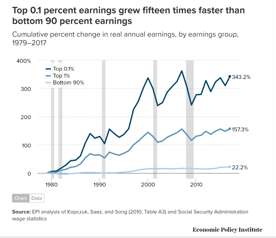
We see from below chart that it is Top 0.1% again that pockets all the riches. The top 1% of earners saw cumulative gains in annual wages of 157.3% between 1979 and 2017. Over the same period, Top 0.1% earnings grew 343.2 percent, with the latest spike reflecting the sharp increase in executive compensation. Over the same period, despite a growing economy and increases in productivity, the earnings for the bottom 90% only rose 22.2%.[9]
The American media is from time to time trying to give a celebratory twist to labor markets reporting “strong” earnings growth. When the 2018 August jobs report was out and showed a 2.8% annual increase in average hourly earnings, the usual happy talk followed. But when you adjust those figures to inflation all the growth immediately evaporated. The cost of living had gone up 2.7% in the same period, which left wage growth with a 0.1% rounding error.[10] In what has been touted as a booming economy in 2019, average hourly wages earnings grew only 1.2% over inflation by August.
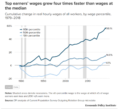
The problem is that most income for the overwhelming majority of households comes from their wages. While the rich gorge on dividends and capital gains in addition to their skyrocketing salaries, the majority just are left with their wages, constantly devaluating in real terms. Over the entire period, contributions of wages and wage-related income for Top 1% averaged just under 40%, while it averaged 86% for the bottom 90% of households, more than twice as high.[11]
We see from below chart how for all but the highest earners, hourly wage growth has been miserable.
Here is a link to an interesting article from August 2019, depicting the reality of low-wage working poor in today’s America: Low Wages, Sexual Harassment and Unreliable Tips. This Is Life in America’s Booming Service Industry
All productivity gains go to the already rich
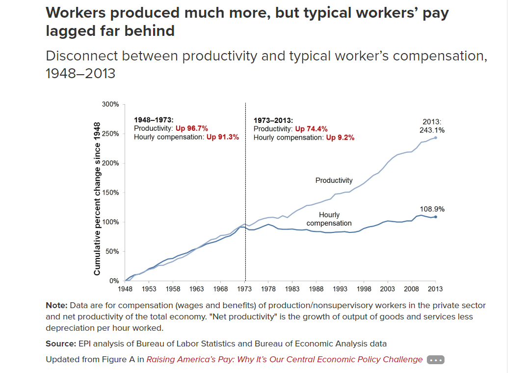
What has happened is that workers earnings have since the neoliberal turn in the 1970s seriously fallen behind productivity gains (the growth of output of goods and services) as the benefits have gone to capital and the executive class. Below figure shows that in the three decades following World War II, hourly compensation of the vast majority of workers rose 91%, exactly in line with productivity growth. But after that the curves started to diverge dramatically as the pay for the vast majority lagged further and further behind overall productivity and the superrich. From 1973 to 2013, hourly compensation of a typical (production/nonsupervisory) worker rose just 9% percent while productivity increased 74%. And this pernicious trend has only got worse in the last decade.[12]
This indicates a shift in income from labor (persons who derive income from hourly wages and salaries) to capital (persons who derive income via ownership of businesses, land and assets).
Nowhere is income inequality and the egregious worsening trend so manifest as in the case of CEO pay. In the 1970s CEOs made 30 times what typical workers made, but by 2017 the CEOs made 361 times the workers’ pay.[13] According to the Economic Policy Institute CEO compensation has grown 940% since 1978, while typical worker compensation has risen only 12% during that time.[14] In its research, the Institute arrived to a 278:1 ration for CEO-to-worker pay. CEOs even outperformed the rest of the dismal decimal, growing their pay grab three times faster than the rest of the top 0.1%. The rising pay of executives was the main factor in Top 0.1 percent’s super grab of household income. [15] The Fed fueled financial market orgy is the main cause for the windfall riches of CEOs as stock options and the accompanying share buybacks make up a huge part of CEO pay packages.
The average employee now needs to work more than a month to earn what the CEO earns in one hour.[16]
Growing wealth inequality
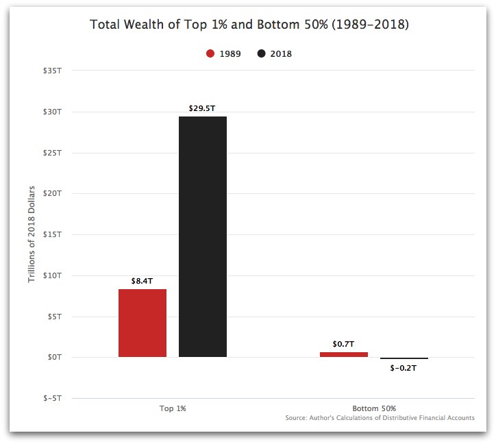
Income inequality obviously leads to wealth inequality, but here the figures are yet more striking in showing the magnitudes of the grab at the top. Since 1989, Top 1% captured $21 trillion in wealth, while Bottom 50% lost $900 billion, actually pushing them down to negative wealth, meaning they have more debt than they have assets. (Below chart). On a net analysis, half of Americans own nothing.
The Federal Reserve, which records household wealth, includes consumer durables in wealth figures. Consumer durables – things like cars and fridges – are the only assets the Bottom 50% own. But the author of the above chart adjusted the Fed figures by subtracting out those things. He rightly considers that those fast depreciating assets cannot be considered as constituting wealth in today’s world – more like debt traps for the Bottom 50%.
The real wealth constitutes of real estate, stocks (all forms of business ownership, direct or indirect ownership through funds and trusts) and bonds, and intellectual property rights. Stocks is really where the richest shine. In 2016, the richest one percent held more than half of all outstanding stock, financial securities, and all other sorts of equity, as well as 40% of non-home real estate. The remainder of those asset categories were held by the rest of Top 10, who owned over 93% of all stock and mutual fund ownership.[17] What wealth the remaining 90% may own is largely residential housing, the homes where they live. According to Jonathan Tepper, the wealthiest 1% own nearly 50% of stock and the top 10% more than 81%. The so-called middle class owns only 8% of all stock.[18] Only 10% of Americans own stocks indirectly through pension plans. That is down from 60% in 1980.[19]
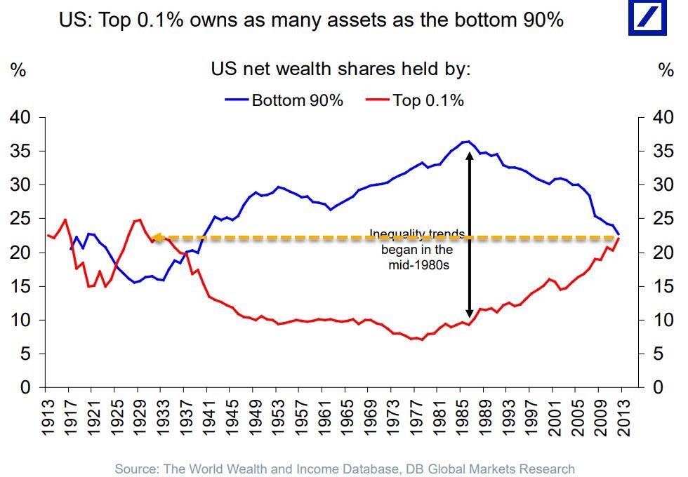
Back in 1962, the top one percent’s share of America’s wealth at 33% was equal to that of Bottom 90%, but in the early 1980s the share of Bottom 90% started a steep descent and by 2016 their share had dwindled down to 21%. Especially after the Federal Reserve shifted its market rigging low-interest-rate money-pumping policy into high gear from the beginning of 2000s, the superrich have experienced a massive rise in their fortunes, as illustrated by below chart.[20]
A recent study revealed that the concentration on the top is yet much more pernicious. It’s not any more a question of Top 10%, and not even Top 1%, as it is the Top 0.1% – the Dismal Decimal – that has now concentrated the wealth of the nation (and half the world) in their greedy hands. Top 0.1% now holds as much wealth as Bottom 90% combined. As the below chart shows, we are essentially back to the Roaring Twenties…a lesson not learned. Actually, in the aftermath of the Great Depression, America entered an unprecedented era of four decades of prosperity with a more equal distribution of wealth as Bottom 90% recovered strongly in distribution of wealth at the expense of Top 0.1%.
Wealth and income age gap even worse
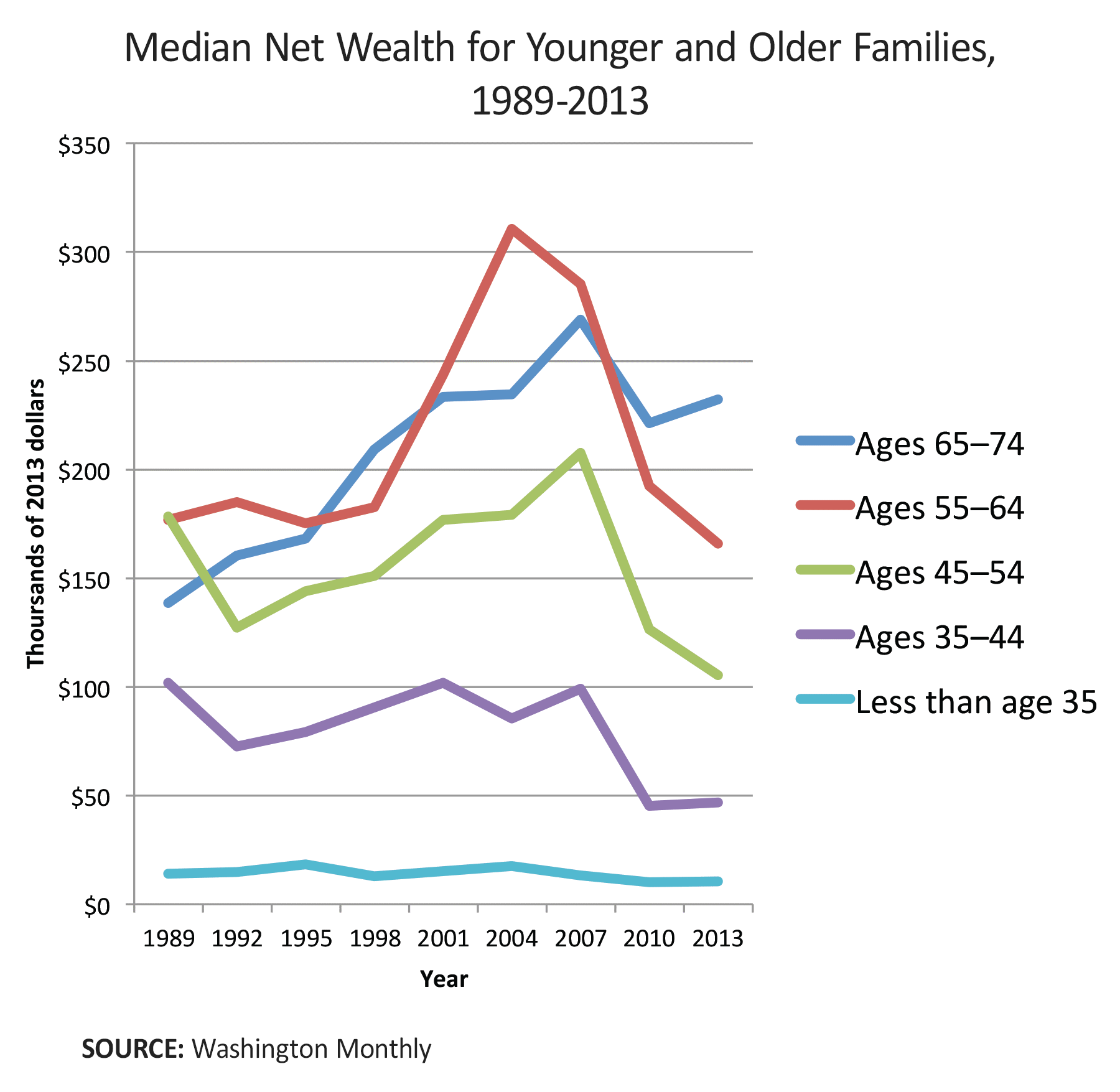
The wealth gap picture gets worse yet when we look at the age distribution of wealth. Baby Boomers born between the end of the Second World War and 1964 currently hold wealth that is 11 times higher than that of millennials.[21] The pervasive downward mobility has led to most major demographic groups in the United States, including college graduates, having less wealth and earn less money after inflation than did their counterparts a generation ago.
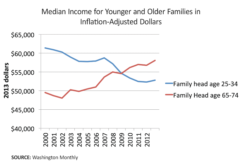
The possessions (net wealth) of age groups have obviously followed the same trend as above income chart showed. Each generation after those who were 65 to 74 in 2013 have seen their net wealth decline. Only inheritance can bring some relief to the presently younger generations, which will in general not come before they themselves approach old age. Below another chart which illustrates the collapse in wealth of younger generations.
Gender gap is closing
It must come as a surprise to many, that income of women has in the last half a century risen more than that of men. Adjusted for inflation, median income for women went from $30,000 in 1980 to $40,742 in 2015. But on the contrary, the income of men at $51,212 in 2015, was lower in real terms than it had been in 1974.[22] The inflation-adjusted earnings from wages, salaries, etc. for full-time employed men have fallen 4.4% since 1973[23] while during the last twenty years women’s wages have risen double as fast as those of men. But that is not much to brag about because the growth for men has been miserly at 0.25% for year, while that of women was a “staggering” 0.5% per annum.[24]
Misleading labor statistics
While the official unemployment figure is presently near historical lows – and at levels what some economists would like to call full employment – there are some big problems with it. 1. Problems with the official unemployment statistics. The officially touted unemployment figure (so-called U3 unemployment) record only those who have been looking for a job during the last 4 weeks, while discouraged long-term unemployed are cleansed from the statistics and left unrecorded as if they would not be in the workforce at all – makes stats look beautiful for the powers that shouldn’t be. 2. The labor participation rate has been falling. 3. New job creation has amounted to only a third of the annual increase in working age population. 4. Part-time and gig jobs count as full-time employment. Any person who takes a part-time or gig job for just a few hours a month is recorded among the employed, although they would rightly be considered unemployed merely clutching at straws. 5. Connected with the previous point, there is also a more general problem with the quality of jobs created. Most jobs created in the last two decades are low-paid low-skill jobs that do not provide a life-sustaining income considering the cost of living in the United States.
Problems with the official unemployment statistics
In November 2019, the official US unemployment rate clocked in at 3.5%, the lowest since 1969. But, this official government and media hyped unemployment figure (U3 unemployment) record only those who have been looking for a job during the last 4 weeks, while discouraged long-term unemployed and desperate part-time and gig workers are cleansed from the statistics. They are considered not to form part of the labor force anymore and therefore not unemployed either.
To be sure, the government actually records a U6 unemployment rate, too. Here the deplorables are counted but this measure is ignored by both the government and the media.
The U-6 rate is the unemployment rate that includes discouraged workers who have quit looking for a job and part-time workers who are seeking full-time employment. The U-6 rate is considered by many economists to be the most revealing measure of a country’s unemployment situation since it covers the percentage of the labor force that is unemployed, underemployed and discouraged.
As of November 2019, the U6 unemployment rate was 6.9%, which is already double the official 3.5% rate. Some economists argue that even this U6 measure is rigged and that the real unemployment is much higher. Professor Jack Rasmus would put the true unemployment rate at 10 to 12%.[25]
Economist David Stockman reported end of 2014 that the number of jobs created since the turn of this century had grown at only 0.3% annually – a rate which amounts to only 49k jobs per month or about one-third of the growth rate of the working age population.[26] After 2014, jobs creation has, however, picked up considerably, private-sector employer’s having added 19.5 million jobs since the Great Recession of 2008.[27]
The labor force participation rate and new jobs creation
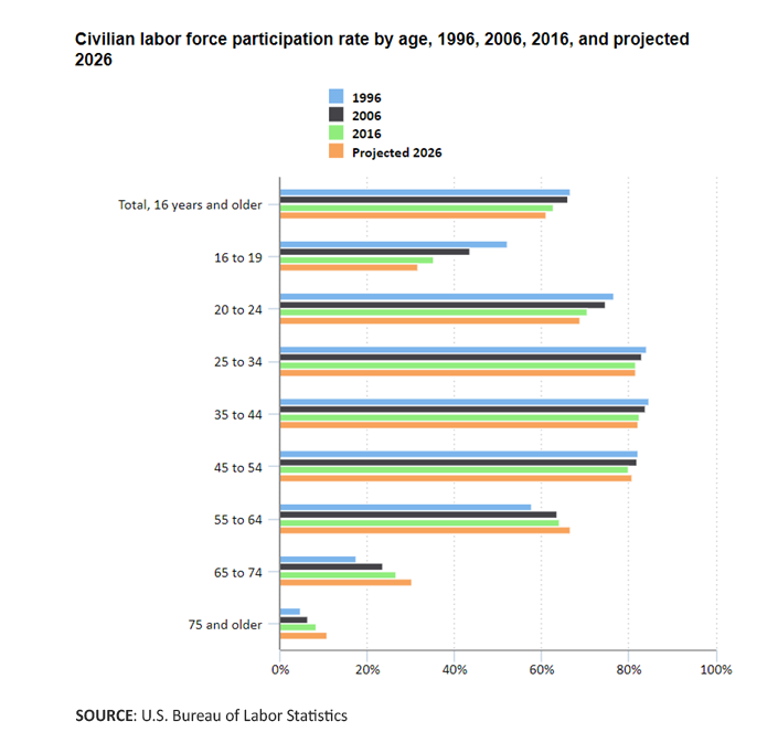
Some economists maintain that the falling labor force participation rate supports the conclusion that the true unemployment rate is even higher than the suppressed U6 figure. But this question would seem to be debatable. The thing is that labor force participation rate is calculated out of all people 16 and older all the way up to the oldest people without limit. That is not how the labor force participation rate is calculated according to international standards. OECD defines labor force participation rate as the labor force divided by the total working-age population, that is people aged 15 to 64.[28]
With an ageing population the figures can therefore be very misleading concerning the United States. On the other hand, the picture is blurred by the fact that many people who are already past working age (over 64) in fact do work in order to supplement their meager pensions.
However, there is some overlap between formally retired people and the working age population, as the BLS reported that the labor force participation rate for older workers of retirement age surged to the highest level in 7 years.[29] In fact, the number of people receiving old-age pension is also at all-time high.
The below chart shows how there is a fairly good labor force participation rate among the working age population, with younger people still in school and older people mainly retired.
Part-time and gig jobs count as full-time employment as there are less and less quality jobs
The biggest problem with the jobs statistics is in how to properly account for real labor force participation and unemployment due to the prevailing trend of part-time and gig jobs. Any person who takes a part-time or gig job for just a few hours a month is recorded among the employ, although they would rightly be considered unemployed merely clutching for straws. Economists David Stockman and Mike Shedlock have tried to address the problem by looking at actual hours worked per week and per year.[30] [31] Indeed, the government’s Bureau of Labor Statistics officially measures the average hours worked per week, but not many seem to be paying attention to them. The average hours per week has trended steeply downwards, from around 39 hours per week in the mid-1960s to a low of 33 hours at the end of the last recession. We reported above, what this has meant for real weekly earnings. There has been a modest post-recession recovery by a trivial 0.7 bounce (or 42 minutes).
Connected with the previous point, there is also a more general problem with the quality of jobs created. The official statistics counts a 10 hour per week temporary gig and real 40 hours a week job as the same.
David Stockman gives an excellent account of the deteriorating quality mix of jobs as per 2014.[32] Stockman shows how the low-quality, low-paid, low-hour jobs have been prevailing in the last decades. Focusing on the October 2014 jobs print, he identified 15 thousand manufacturing jobs gained versus 52 thousand in leisure and hospitality, that is, burger flippers, bar-tenders, waiters, bell-boys, ticket takers and hot dog vendors). This is not meant as an offense to the people forced to take those jobs in lack of others, but a criticism of the state of the nation. According to Stockman, the manufacturing jobs average about 41 hours per week at $25/hour, yielding an annualized manufacturing wage at about $53,000. This while the leisure and hospitality jobs deliver only 26 average weekly hours at $14/hour, giving an annualized earning of only $19,000. Retail clerks also added 27 thousand jobs, which posted 31 average hours per week at $17/hour or $27,000 at an annual rate.
On the other hand, high-paid jobs (37 hours per week, $34 per hour and $65,000 per year) in the IT-sector declined by 4,000 in the same period. This represents a consistent trend since 2008, with a 100 thousand net loss of jobs in this category by 2014 – a 850 thousand loss since 2000.
There were 5.4 million or 22% fewer goods producing jobs in October 2014 than there were the in the beginning of 2001.[33]
Stockman talks about something he terms “breadwinner jobs.” These are the decently paid quality jobs, which pay enough to sustain a normal life. Stockman’s breadwinner jobs are not only the 19 million jobs in manufacturing and mining, but also another 50 million jobs encompassing the other major full-time, full-pay categories. Those include about 8 million jobs in finance, insurance and real estate; 17 million professional expert jobs such as lawyers, accountants, architects, computer designers, engineers, and business managers and consultants; 8 million jobs in transport and logistics; and 17 million more in core government jobs outside of education, as well as utilities, the postal service.
Although the breadwinner jobs comprise about half of all jobs and two-thirds of the value-added, they have not been growing since 2000, by 2014 their number was still 3.5 million or 5% lower than it was at the peak in early 2001. In the same period 4 million part-time jobs were created.
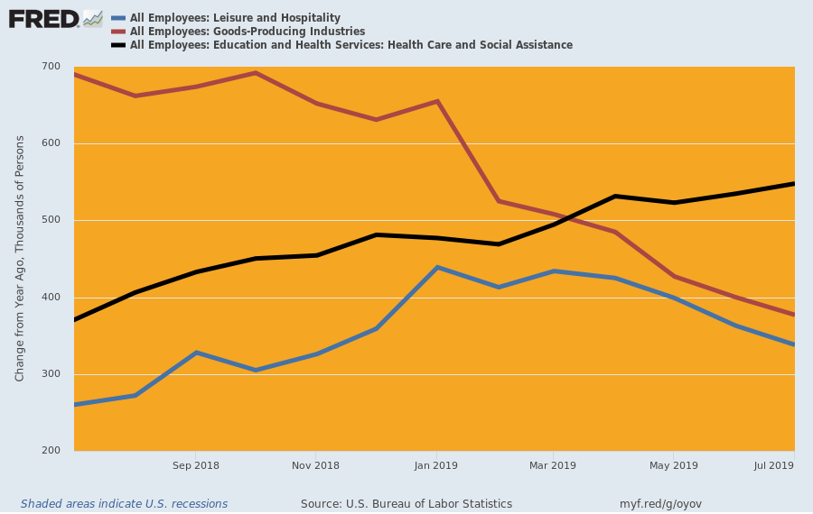
In an article of August 16, 2019, Stockman showed that the trend outlined above has continued unabated through 2019, as illustrated in the following chart.[34]
The year-on-year jobs gain in the goods-producing sectors has fallen sharply, from 690,000 in July 2018 to just 338,000. In the same period, by contrast, leisure and hospitality picked up from 260,000 to 377,000, whereas education, healthcare and social services surged from 371,000 in July 2018 to 548,000 in the month just posted.
There has not been any improvement in the aggregate job hours either. Despite the 2,162,000 of net new jobs created in the private-sector from 7/2018-7/2019, the index for aggregate weekly hours was unchanged at 111.9 during that period. The average workweek had in the year only inched up by 10 minutes from 34.3 to 34.5 hours.[35]
What’s bad is that the lower quality jobs are also leaving American workers without the benefits they used to enjoy (such as healthcare insurance, vacation pay, and pension plans).
Americans are drowning in debt to make up for failing incomes
GDP has been inflated by Fed money printing and federal borrowing, but consumer debt is the other leg that keeps the GDP balloon in the air. Because of sinking – or at best stagnant wages -out of necessity – or in an attempt to live the long-dead American dream – Americans are resorting to debt, a lot of it.
Housing rents, telecommunication, healthcare and education costs are increasingly pushing the consumer into a rabbit hole with no exit. A 2017 study found that 40% of US adults struggle to pay for basic necessities like food, healthcare, housing, and utilities.[36]
Most Americans have depleted all their spare resources as a staggering 78% of full-time workers are reported to live from paycheck to paycheck.[37] Note, that was about full-time workers, add to it the jobless and the army of part-time workers – who don’t even live on the paycheck – and we must be getting closer to 90%.
To make ends meet – or for a last-ditch effort to fund the consumption driven lifestyle of the old American dream – people have resorted to massive borrowings. Increased access to predatory loans was in 2019 the only factor that kept the US economy seemingly going, consumer spending in the third quarter of 2019 growing at 3.3% annual pace.
US households had nearly $14 trillion in outstanding debt at the end of the third quarter 2019. That debt load now equals 73% of GDP and some economists would argue that it’s good because it is lower than the 83% a decade ago. While the debt is sharply up in absolute dollars, it is only its share of GDP that has declined. And digging a bit deeper into the figures, the merriment evaporates altogether. Thing is that traditionally the biggest share of household debt has gone towards funding home acquisitions, but with the increasing economic squeeze fewer can afford buying a house even with the relatively low interest rates. Therefore the share of home mortgages has dropped, while predatory loans for pure consumption has grown.[38] Housing has traditionally represented the only wealth of the vast segments of Americans below the top 20%, and now even those assets are increasingly beyond reach. On the contrary consumption debt is up by $2 trillion since 2014.[39] To wit, a recent report found that median home prices (4th quarter 2019) were unaffordable for average wage earners across 71% of US counties as home price growth was outpacing wage growth.[40]
Far from trying to protect the people, the government has facilitated the debt trap set by the financial oligarchy pushing a massive growth of payday loans, credit card debt, auto loans, and other wealth-destroying consumer credits. It wasn’t always like that, in a more humane and socially oriented America before the late 1970s, the people were largely protected from predatory lending by usury laws, for example, which capped fees and interest costs on loans.[41]
The biggest growth has been in auto loans, which leaves the consumer with a rapidly depreciating asset but a lot of debt.
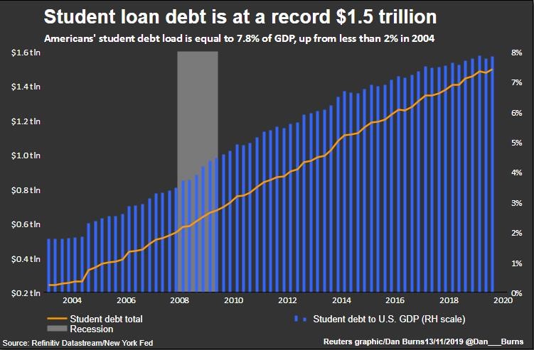
It’s been even worse with education costs. By March 2019, the amount of outstanding student loans at $1.5 trillion had more than doubled from a decade earlier.[42] Since 2004, the weight of the student loan millstone has gone up fivefold from only $250 billion to today’s $1.5 trillion.
That’s due to the huge price inflation in higher education. The cost of both public and private college escalated by 40% over the general consumer price inflation between 2005 and 2015.[43] Student debt is now equal to nearly 8% of GDP, up from less than 2% in 2004.[44] To make matters worse, a bigger share of young adults are now forced to finance their studies with loans, that share having risen from 26% of students in 2001 to 40% in 2010.[45] Of all adults about 15%, and one-third of adults under age 30, have student loan debt. Obviously, the people carrying on their shoulders this massive student debtberg of $1.5 trillion belong to the increasingly destitute middle classes and not the rich.
Young people and their parents are desperately trying to hang on to the old American dream thinking that education is the solution. But in reality, college and university studies are increasingly more expensive and useless and more form over substance as students now are indoctrinated with theories which don’t deliver useful professional skills and don’t prepare for life. All too often then, the graduate is left only with a huge loan, but no marketable skills. Worse yet, much of the student loans are held by college dropouts.
In connection with the insanely rising healthcare costs and a collapse of health insurance coverage, Americans have also increasingly been forced to borrow in order to pay for medical treatment. According to shocking findings by the American Cancer Society, 137.1 million US residents suffered medical financial hardship in 2018. Americans had to resort to borrow a total of $88 billion in 2018 only to cover for essential medical treatment.[46]
Most people have no savings
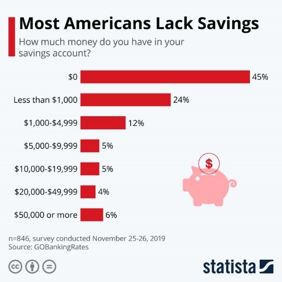
Huge real price inflation on basic necessities (hidden in official stats by the government) and the debt service burden has depleted most Americans of all their savings. Nearly 70% of Americans have virtually no savings. Bottom 55% have zero savings, while the following 24% – the core of the former middle class – have only $1,000 stashed away.[47]
The other side of the (non-existent) coin is that the same 45% of Americans would obviously struggle to come up with $400 for an unexpected expense.[48] By extension, the former middle class – those with the miserly savings of $1,000 – would also have real troubles in coping with any kind of bill for medical treatment without dipping into more debt. Considering the above reported findings (see the chart) only the Top 10% would be financially secure in a medical emergency.
We have reported on the oligarch takeover and monopolization of US healthcare and the ensuing social crisis in a recent study titled: The Oligarch Takeover of US Pharma and Healthcare – And the Resulting Human Crisis
Inflation scam
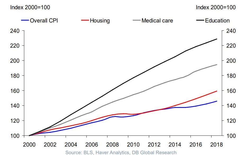
In reality, the situation with income and wealth inequality and stagnating wages could be yet much worse, because there are obvious problems with the official inflation figures, which are designed by the government to understate actual prices increases. To start with the inflation measure employed by the Federal Reserve (CPI) is a broad average purporting to reflect prices increases for all consumer goods and services. Herein lies the initial problem as the consumption habits of Americans are so different. Some of the products whose prices have risen less or decreased tend to be those that have a bigger weight in the purchases of the rich, whereas prices for products that represent a bigger part of what the less fortunate (i.e. 80% of Americans) need have gone up much more. Especially this concerns, healthcare (both health insurance and medical care), education, and housing (in particular what concerns first-time homebuyers and rentals), which all have risen substantially more than wages over the last two decades. This is perfectly illustrated by below chart, which shows how much said services have risen over average pay rises.
The second serious problems with the way inflation is measured in the US stems from a deliberate attempt of the authorities to understate real inflation. The most egregious stratagem is the method employed since 2012 based on the Orwellian concept of “constant level of satisfaction.” By this formula the government manipulates the contents of the inflation measurement basket so that, after persistent price rises, items that consumers no longer can afford are replaced by lower cost alternatives. This is the US government’s version of “Let them eat cake.” If the peasants cannot afford beef, let them eat chicken. When the price of beef has gone up so much that people stop consuming it in former quantities, the government excludes beef from the index (or reduces its index weight). Then voilà, the inflation disappeared. Once you cannot afford beef anymore, then the price of it doesn’t matter, and thence the cost has not gone up. Logical? According to US government, yes. Following this logic, when people cannot any longer afford anything but bread (considering that pizza essentially is bread, this is already the reality for a huge number of Americans), then there is still no inflation as all the better quality food has been purged from the index.
In summary, we could say that this method does not anymore measure inflation but the cost of maintaining the peasants. A falling standard of living is precisely what the actual inflation causes, and that’s what the government tries to cover up. Here’s a good source for further reading on this incredible topic: The CPI Understates Inflation Skewing Our Expectations
Another of the government’s tricks employed for understating inflation is to declare price hikes as being motivated by “innovations” and “quality improvements,” in which case they would not be recorded as inflation but great new economic output. Basically any change regardless of actual enhancement of the consumer experience is regularly declared as such improvements. And, then voilà, the inflation disappeared.
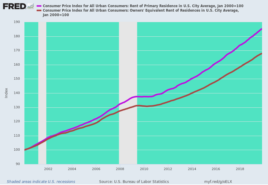
A special trick in the bag is, the way the government calculates an imaginary imputed rent. They estimate the cost of housing based on what homeowners theoretically would pay to rent their own homes from themselves. (This is called, “homeowners’ equivalent rent of residences.”).[49] This imaginary imputed rent plays a very prominent role in the inflation index, having a 24.6% weight in it, whereas actual market rentals only count for 7.9%. At the same time the market-based rentals have gone up significantly faster, as seen from below chart. We argue, that only the market measure should be recorded in the official inflation calculations.
Economists like Paul Craig Roberts have argued that the inflation measures are tampered with in order to avoid cost-of-living adjustments for Social Security recipients and worker’s contracts, which would be due when according to actual inflation.[50]
Similar tricks are performed to manipulate the producer price index which is used to deflate nominal GDP in order to measure real economic growth.[51] Simplifying, we may say that GDP growth is also price rises minus the inflation, GDP being the estimated price of all output of goods and services So, when you understate the inflation, you deduct less from the price rises. And voilà you can boast of a higher GDP growth. Less these tricks, the US GDP growth has in the last decade been much smaller than the government wants us to believe.
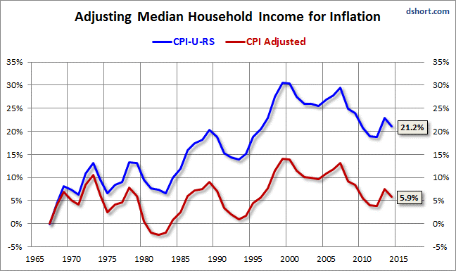
To illustrate how big the differences can be based on various methodological choices, let’s see how those can be reflected in the trends on growth of real inflation-adjusted household income. The Census Bureau – the government office that reports on the median household income – has replaced the more common CPI-U inflation measure in favor of the CB’s own CPI-U-RS. The CB’s method – predictably – shows (below chart) a better dynamics for household income than was actually delivered when researchers readjusted the statistics with the common measure.[52]
(Since the late 1990s, the two measures have largely converged).
[1] A simple chart shows what some economists consider to be the ‘most striking development’ in 40 years of the US economy
[3] ‘Record median household income’ is hiding a chilling fact
[4] Why We’re Doomed: Stagnant Wages
[5] For most U.S. workers, real wages have barely budged in decades
[6] The Good Old Days Of Tricky Dick Are Not MAGA: Real Hourly Worker Wages Are Still At 1972 Levels
[7] Low-wage work is more pervasive than you think, and there aren’t enough “good jobs” to go around
[9] Decades of rising economic inequality in the U.S.
[10] Real Wage Growth Is Actually Falling
[11] Decades of rising economic inequality in the U.S
[12] We can’t find the page you’re looking for
[13] Tepper, Jonathan. The Myth of Capitalism: Monopolies and the Death of Competition (2018). p. 206
[14] CEO compensation has grown 940% since 1978
[15] Wage Stagnation in Nine Charts
[16] Wage Stagnation in Nine Charts
[17] America’s Richest 1% Now Own As Much Wealth As The Middle And Lower Classes Combined
[18] Tepper, Jonathan. The Myth of Capitalism: Monopolies and the Death of Competition (2018), page 197
[19] Pension disaster looms over the horizon
[21] America’s Richest 1% Now Own As Much Wealth As The Middle And Lower Classes Combined
[22] That 5.2% Jump in Household Income? Nope, People Aren’t Suddenly Getting Big-Fat Paychecks
[23] ‘Record median household income’ is hiding a chilling fact
[24] Wage Growth For Men About 1/4% Per Year Since 2000, Women About 1/2% Per Year
[25] True US Unemployment Rate ‘Underestimated Grossly’ by Labor Department Numbers
[26] The Fed’s Paint-By-The-Numbers Delusions About The Labor Market
[27] For most U.S. workers, real wages have barely budged in decades
[28] Labour force participation rate
[29] More Fake Happy News About Jobs
[30] “Real” and “Unreal” Wages; Five Decades of Middle Class Decline in Pictures
[31] “Real” and “Unreal” Wages
[32] The Fed’s Paint-By-The-Numbers Delusions About The Labor Market
[33] The Fed’s Paint-By-The-Numbers Delusions About The Labor Market
[34] The U.S. Labor Market Screams “Recession!”
[35] The Central Bank Time Machine
[36] Study: 40 Percent of Americans Struggle to Afford Basic Needs
[37] Most Americans live paycheck to paycheck
[38] U.S. household debt in four charts
[39] U.S. household debt in four charts
[40] Despite Falling Rates, 70% Of US Homes “Unaffordable” To Average American
[42] 5 facts about student loans
[44] U.S. household debt in four charts
[46] US healthcare system in crisis: spends doubly more than peer countries, but falling behind in life expectancy
[47] “I Find It Very Troubling” – Most Americans Lack Savings
[48] Many Americans who can’t afford a $400 emergency blame debt
[49] The CPI Understates Inflation Skewing Our Expectations
[51] The State of the US Economy. Poverty and America’s “Mega-Rich”. Rigged Markets and the Collapse of the “Real Economy”
[52] Median Household Income Growth: Deflating the American Dream

